Introduction
In this tutorial, I will explain how to create Modern Dial.
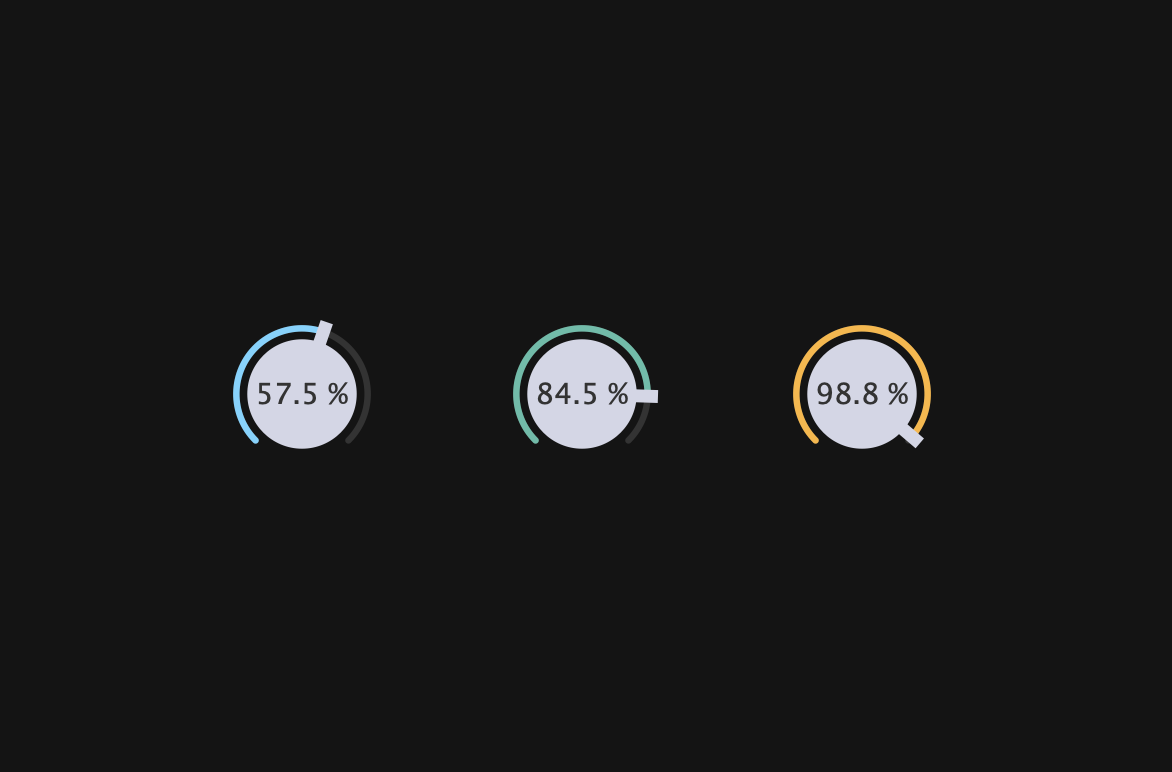
This dial was designed by suzuki kentaro, and I made this with JUCE.
Before we start the tutorial, we need to do a little preparation.
Prerequisites
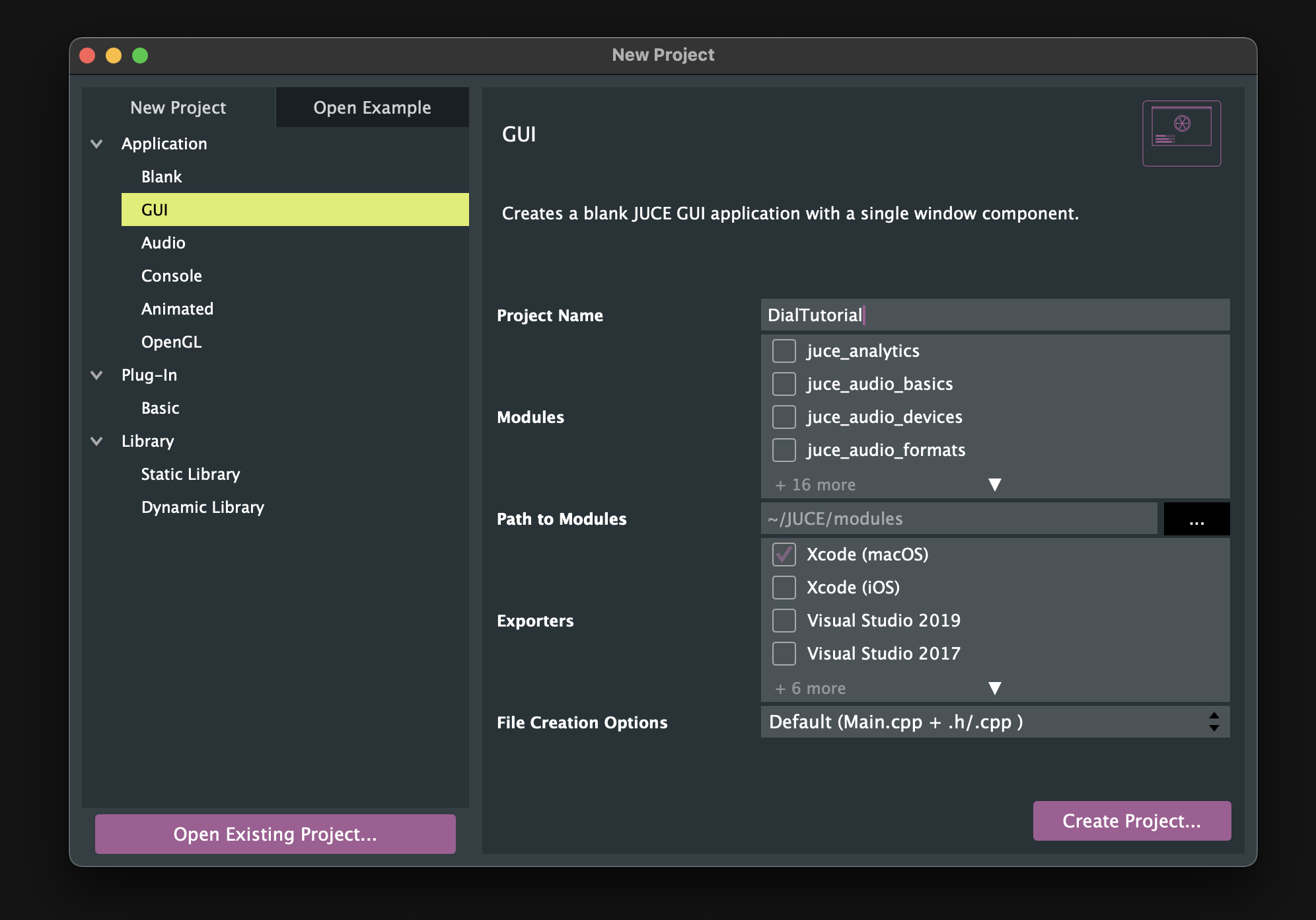
Launch Projucer and create a new project. Since we will only be implementing the UI, let’s select “GUI”.
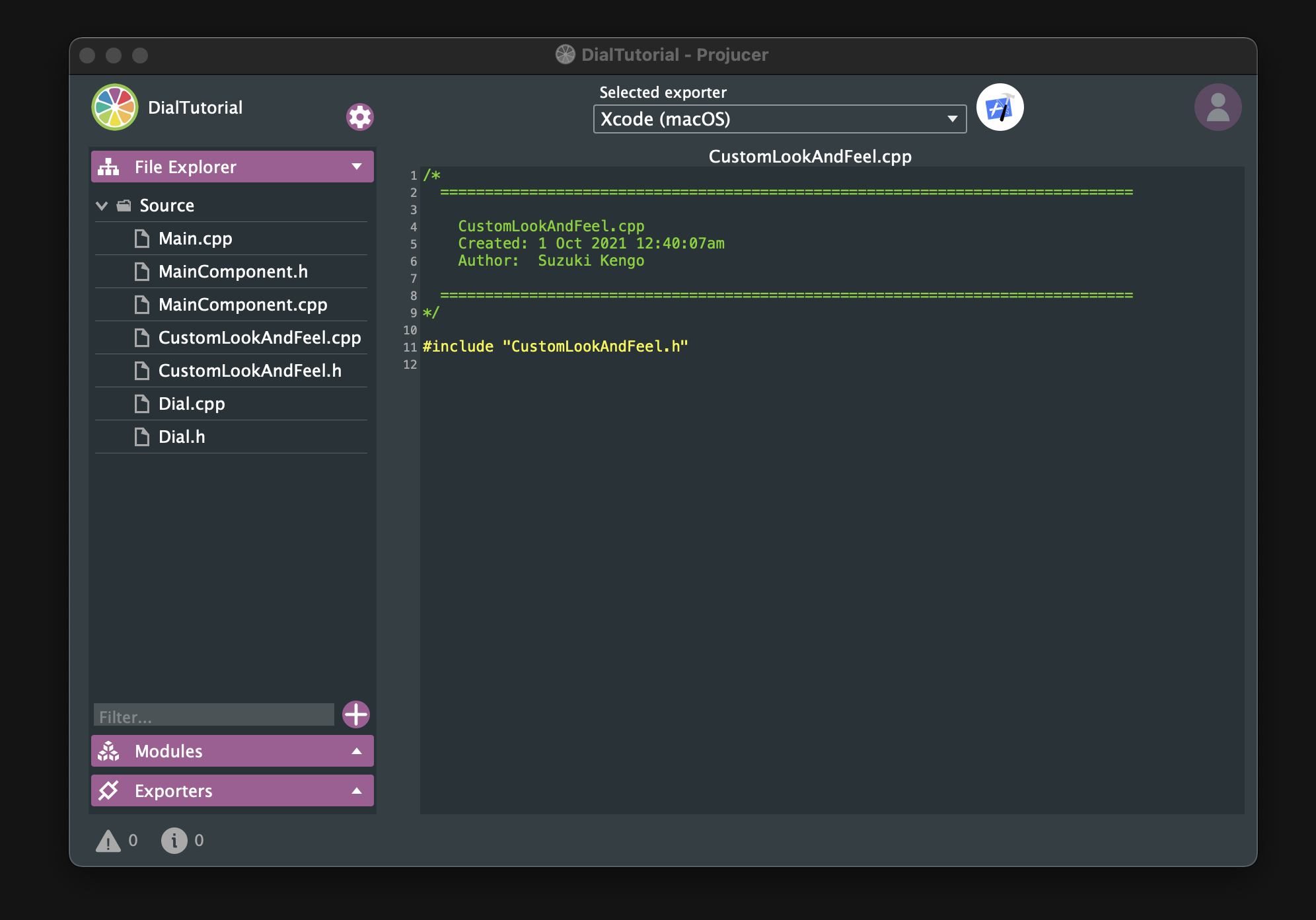
Next, let’s create new cpp and header files for the customized dial and LookAndFeel that we are going to create.
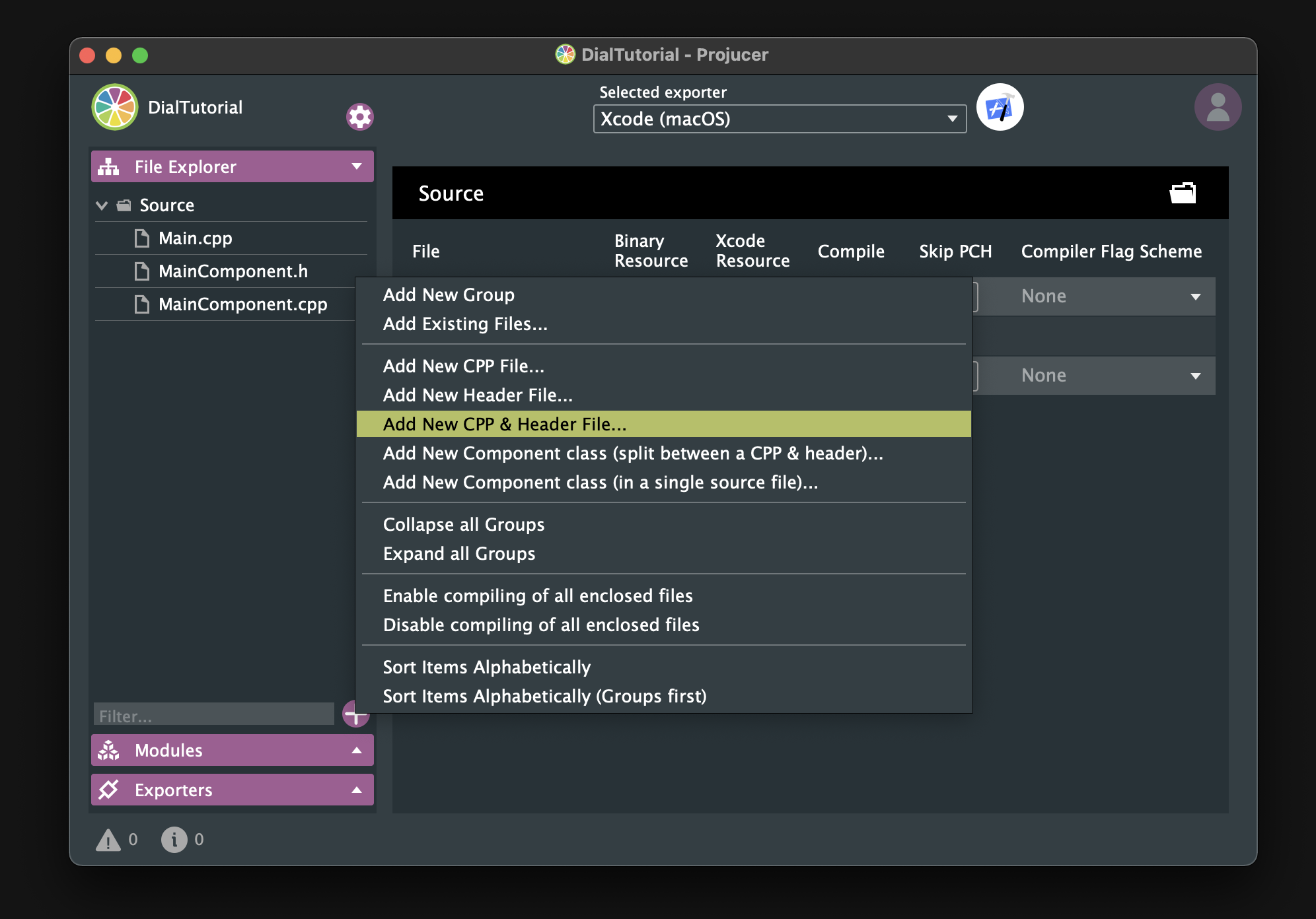
Make sure that these files are placed under the Source directory.
That is all the preparation we need! Let’s get started!
Basic Dial
In this chapter, we will implement the basic parts of Modern Dial.
Customizing slider
First, let’s prepare Dial class that inherits from the Slider class, and override some functions:
#pragma once

#include <JuceHeader.h>

class Dial  : public juce::Slider
{
public:
    Dial();
    ~Dial();

    void mouseDown (const juce::MouseEvent& event) override;
    void mouseUp (const juce::MouseEvent& event) override;

private:
    JUCE_DECLARE_NON_COPYABLE_WITH_LEAK_DETECTOR (Dial)
};
In the constructor below, many member functions are called. I will only explain a few important functions.
Dial::Dial()
{
    setSliderStyle (juce::Slider::SliderStyle::RotaryVerticalDrag);
    setTextBoxStyle (juce::Slider::TextBoxBelow, true, 80, 20);
    setRotaryParameters (juce::MathConstants<float>::pi * 1.25f,
                         juce::MathConstants<float>::pi * 2.75f,
                         true);
    setVelocityBasedMode (true);
    setVelocityModeParameters (0.5, 1, 0.09, false);
    setRange (0.0, 100.0, 0.01);
    setValue (50.0);
    setDoubleClickReturnValue (true, 50.0);
    setTextValueSuffix (" %");
    onValueChange = [&]()
    {
        if (getValue() < 10)
            setNumDecimalPlacesToDisplay (2);
        else if (10 <= getValue() && getValue() < 100)
            setNumDecimalPlacesToDisplay (1);
        else
            setNumDecimalPlacesToDisplay (0);
    };
}

Dial::~Dial()
{
}
For more information about setRotaryParameters(), please check out the following article, which is very helpful. It is really good.
If setVelocityBasedMode() is set to true, not only will the mouse disappear when dragged, but you will also benefit from fine dragging control. To make it easier to see the difference, I turned this mode on and off in the completed Dial:
false:
 true:
true:

I think it’s better to actually turn this mode on and off yourself to make sure you understand it, since there are many sensory elements.
The lambda function called onValueChange implements the process to be executed when the value of the slider is changed. The process we have implemented here is closely related to the appearance.In other words, we make sure that the three digits of the value are displayed for any value. There is quite a difference between implementing this and not implementing it.
before:
 after:

As you can see, it looks beautiful because the width of the numbers does not change much even when the values change.
Next, I will explain the implementation part of mouseDown() and mouseUp().
void Dial::mouseDown (const juce::MouseEvent& event)
{
    juce::Slider::mouseDown (event);

    setMouseCursor (juce::MouseCursor::NoCursor);
}

void Dial::mouseUp (const juce::MouseEvent& event)
{
    juce::Slider::mouseUp (event);

    juce::Desktop::getInstance().getMainMouseSource().setScreenPosition (event.source.getLastMouseDownPosition());

    setMouseCursor (juce::MouseCursor::NormalCursor);
}
You may wonder why we have implemented the process of hiding the mouse pointer when velocity mode is turned on. The reason is that I want to hide it from the moment the mouse is clicked. If this mode is only enabled, the mouse pointer will not disappear when you click the mouse, unless you start dragging the mouse…
The process implemented in mouseUp() ensures that when the mouse is released, it will return to the place where the mouse was first clicked. It may be a small difference, but a steady accumulation of such differences will result in a great UX.
Creating Dial objects
Okay, let’s include the header file and prepare three Dial objects. Also, let’s define the colors to be applied to them.
#pragma once
#include <JuceHeader.h>
#include "Dial.h"
class MainComponent : public juce::Component
{
public:
//==============================================================================
MainComponent();
~MainComponent();
//==============================================================================
void paint (juce::Graphics&) override;
void resized() override;
private:
//==============================================================================
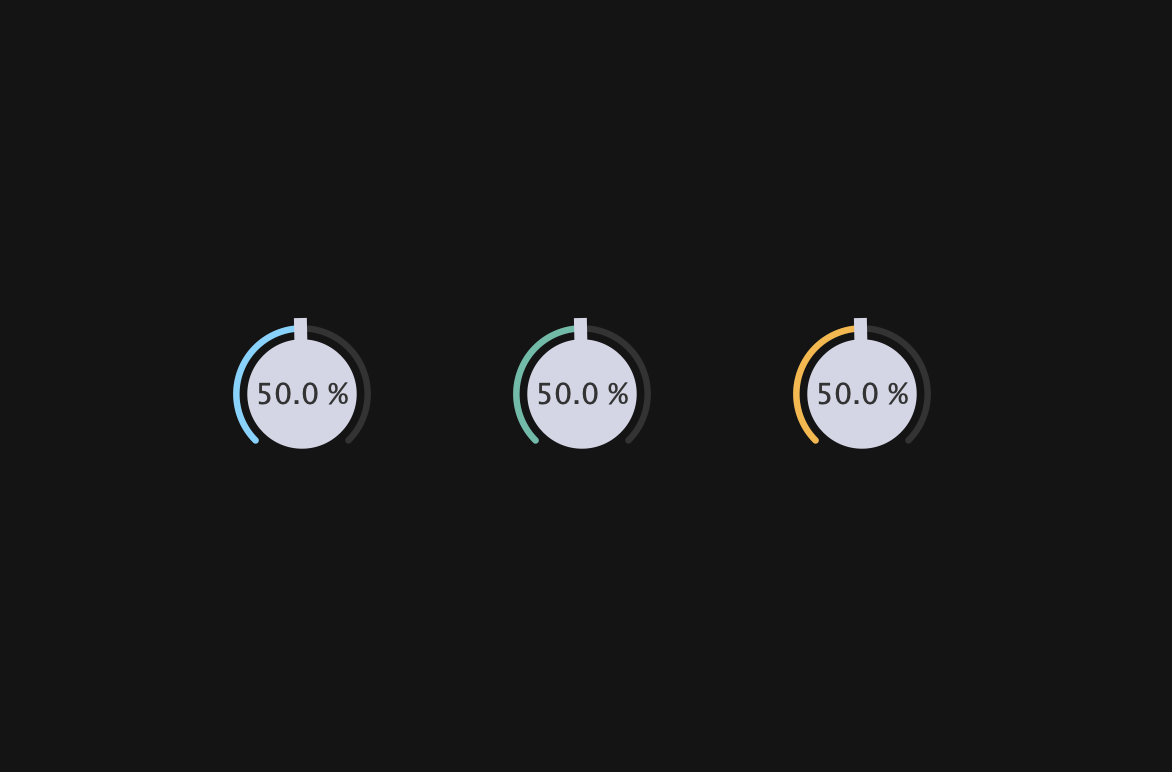
Dial blueDial, yellowDial, greenDial;
juce::Colour blue = juce::Colour::fromFloatRGBA (0.43f, 0.83f, 1.0f, 1.0f);
juce::Colour green = juce::Colour::fromFloatRGBA (0.34f, 0.74f, 0.66f, 1.0f);
juce::Colour yellow = juce::Colour::fromFloatRGBA (1.0f, 0.71f, 0.2f, 1.0f);
juce::Colour black = juce::Colour::fromFloatRGBA (0.08f, 0.08f, 0.08f, 1.0f);
JUCE_DECLARE_NON_COPYABLE_WITH_LEAK_DETECTOR (MainComponent)
};
The definition part is as follows. It’s not difficult, so I’ll skip the explanation.
#include "MainComponent.h"

//==============================================================================
MainComponent::MainComponent()
{
    setSize (600, 400);

    blueDial.setColour (juce::Slider::rotarySliderFillColourId, blue);
    greenDial.setColour (juce::Slider::rotarySliderFillColourId, green);
    yellowDial.setColour (juce::Slider::rotarySliderFillColourId, yellow);

    addAndMakeVisible (blueDial);
    addAndMakeVisible (greenDial);
    addAndMakeVisible (yellowDial);
}

MainComponent::~MainComponent()
{
}

//==============================================================================
void MainComponent::paint (juce::Graphics& g)
{
    g.fillAll (black) ;
}

void MainComponent::resized()
{
    blueDial.setBounds (120, 160, 80, 80);
    greenDial.setBounds (260, 160, 80, 80);
    yellowDial.setBounds (400, 160, 80, 80);
}
Building
Yes! Now the basic part of Modern Dial is complete. Let’s build it!
LookAndFeel
In this chapter, we will customize the LookAndFeel class to almost complete Modern Dial.
Customizing LookAndFeel
The contents of the header file are as follows. Let’s override the three member functions related to the slider description.
#pragma once

#include <JuceHeader.h>

class CustomLookAndFeel : public juce::LookAndFeel_V4
{
public:
    CustomLookAndFeel();
    ~CustomLookAndFeel();

    juce::Slider::SliderLayout getSliderLayout (juce::Slider& slider) override;

    void drawRotarySlider (juce::Graphics&, int x, int y, int width, int height,
                           float sliderPosProportional, float rotaryStartAngle,
                           float rotaryEndAngle, juce::Slider&) override;

    juce::Label* createSliderTextBox (juce::Slider& slider) override;

private:
    juce::Colour blue      = juce::Colour::fromFloatRGBA (0.43f, 0.83f, 1.0f,  1.0f);
    juce::Colour offWhite  = juce::Colour::fromFloatRGBA (0.83f, 0.84f, 0.9f,  1.0f);
    juce::Colour grey      = juce::Colour::fromFloatRGBA (0.42f, 0.42f, 0.42f, 1.0f);
    juce::Colour blackGrey = juce::Colour::fromFloatRGBA (0.2f,  0.2f,  0.2f,  1.0f);

    JUCE_DECLARE_NON_COPYABLE_WITH_LEAK_DETECTOR (CustomLookAndFeel);
};
I will start with an explanation of getSldierLayout(). This member function implements the process of setting the positional relationship and size of the slider and text box. The dial we will create have a text box in the center, so we will implement it as shown below:
#include "CustomLookAndFeel.h"

CustomLookAndFeel::CustomLookAndFeel() {};
CustomLookAndFeel::~CustomLookAndFeel() {};

juce::Slider::SliderLayout CustomLookAndFeel::getSliderLayout (juce::Slider& slider)
{
    auto localBounds = slider.getLocalBounds();

    juce::Slider::SliderLayout layout;

    layout.textBoxBounds = localBounds;
    layout.sliderBounds = localBounds;

    return layout;
}
drawRotraySlider() is the member function that has the most impact on the appearance of a rotary-style slider. It fine-tunes the values so that the appearance is not lost when the dial is resized, and rounds the corners of the background arc and the arc representing the value.
void CustomLookAndFeel::drawRotarySlider (juce::Graphics& g, int x, int y, int width, int height, float sliderPos,
                                          const float rotaryStartAngle, const float rotaryEndAngle, juce::Slider& slider)
{
    auto fill = slider.findColour (juce::Slider::rotarySliderFillColourId);

    auto bounds = juce::Rectangle<float> (x, y, width, height).reduced (2.0f);
    auto radius = juce::jmin (bounds.getWidth(), bounds.getHeight()) / 2.0f;
    auto toAngle = rotaryStartAngle + sliderPos * (rotaryEndAngle - rotaryStartAngle);
    auto lineW = radius * 0.085f;
    auto arcRadius = radius - lineW * 1.6f;

    juce::Path backgroundArc;
    backgroundArc.addCentredArc (bounds.getCentreX(),
                                 bounds.getCentreY(),
                                 arcRadius,
                                 arcRadius,
                                 0.0f,
                                 rotaryStartAngle,
                                 rotaryEndAngle,
                                 true);

    g.setColour (blackGrey);
    g.strokePath (backgroundArc, juce::PathStrokeType (lineW, juce::PathStrokeType::curved, juce::PathStrokeType::rounded));

    juce::Path valueArc;
    valueArc.addCentredArc (bounds.getCentreX(),
                            bounds.getCentreY(),
                            arcRadius,
                            arcRadius,
                            0.0f,
                            rotaryStartAngle,
                            toAngle,
                            true);

    g.setColour (fill);
    g.strokePath (valueArc, juce::PathStrokeType (lineW, juce::PathStrokeType::curved, juce::PathStrokeType::rounded));

    auto thumbWidth = lineW * 2.0f;

    juce::Path thumb;
    thumb.addRectangle (-thumbWidth / 2, -thumbWidth / 2, thumbWidth, radius + lineW);

    g.setColour (offWhite);
    g.fillPath (thumb, juce::AffineTransform::rotation (toAngle + 3.12f).translated (bounds.getCentre()));

    g.fillEllipse (bounds.reduced (radius * 0.28));
}
Next, let’s override createsSliderTextBox(), which implements the process of describing the text box in which the value will be displayed.
juce::Label* CustomLookAndFeel::createSliderTextBox (juce::Slider& slider)
{
    auto* l = new juce::Label();

    l->setFont (17.0f);
    l->setJustificationType (juce::Justification::centred);
    l->setColour (juce::Label::textColourId, slider.findColour (juce::Slider::textBoxTextColourId));
    l->setColour (juce::Label::textWhenEditingColourId, slider.findColour (juce::Slider::textBoxTextColourId));
    l->setColour (juce::Label::outlineWhenEditingColourId, slider.findColour (juce::Slider::textBoxOutlineColourId));
    l->setInterceptsMouseClicks (false, false);

    return l;
}
The most important of the various member functions we are calling is setInterceptsMouseClicks(). If you do not pass false to this function, you will not be able to drag on the text box. Since it is in the center of the dial, not being able to drag is fatal.
true:
 false:
Creating CustomLookAndFeel object
CustomLookAndFeel is applied to the Dial object, so include this header file in Dial.h and prepare the object.
#pragma once

#include <JuceHeader.h>
#include "CustomLookAndFeel.h"

class Dial  : public juce::Slider
{
public:
・・・
private:
    CustomLookAndFeel customLookAndFeel;

    juce::Colour grey      = juce::Colour::fromFloatRGBA (0.42f, 0.42f, 0.42f, 1.0f);
    juce::Colour blackGrey = juce::Colour::fromFloatRGBA (0.2f,  0.2f,  0.2f, 1.0f);
・・・
To apply LookAndFeel to the dial object, call setLookAndFeel(). Also, set the color of the text box and the focus mark that we will implement later.
Dial::Dial()
{
・・・
    setColour (juce::Slider::textBoxTextColourId, blackGrey);
    setColour (juce::Slider::textBoxOutlineColourId, grey);
    setLookAndFeel (&customLookAndFeel);
}
Building
Okay! Let’s build it and see.
Focus Mark
In this chapter, we will implement Focus Mark, a mark that will be depicted when Dial gains focus.
Overriding paint()
Let’s override paint() to make it depict this mark.
class Dial  : public juce::Slider
{
public:
    Dial();
    ~Dial();

    void paint (juce::Graphics& g) override;

    void mouseDown (const juce::MouseEvent& event) override;
    void mouseUp (const juce::MouseEvent& event) override;

private:
・・・
The definition part is as follows:
void Dial::paint (juce::Graphics& g)
{
    juce::Slider::paint (g);

    if (hasKeyboardFocus (false))
    {
        auto bounds = getLocalBounds().toFloat();
        auto h = bounds.getHeight();
        auto w = bounds.getWidth();
        auto len = juce::jmin (h, w) * 0.07f;
        auto thick  = len / 1.8f;

        g.setColour (findColour (juce::Slider::textBoxOutlineColourId));

        // Left top
        g.drawLine (0.0f, 0.0f, 0.0f, len, thick);
        g.drawLine (0.0f, 0.0f, len, 0.0f, thick);

        // Left bottom
        g.drawLine (0.0f, h, 0.0f, h - len, thick);
        g.drawLine (0.0f, h, len, h, thick);

        // Right top
        g.drawLine (w, 0.0f, w, len, thick);
        g.drawLine (w, 0.0f, w - len, 0.0f, thick);

        // Right bottom
        g.drawLine (w, h, w, h - len, thick);
        g.drawLine (w, h, w - len, h, thick);
    }
}
hasKeyboardFocus() is a member function that returns true when a component gains focus. Since the Dial we have created does not have any child components, there is no need to recursively acquire focus, so we have passed false as the argument.
In addition, the following member function must be called in order to gain focus.
Dial::Dial()
{
・・・
    setWantsKeyboardFocus (true);
}
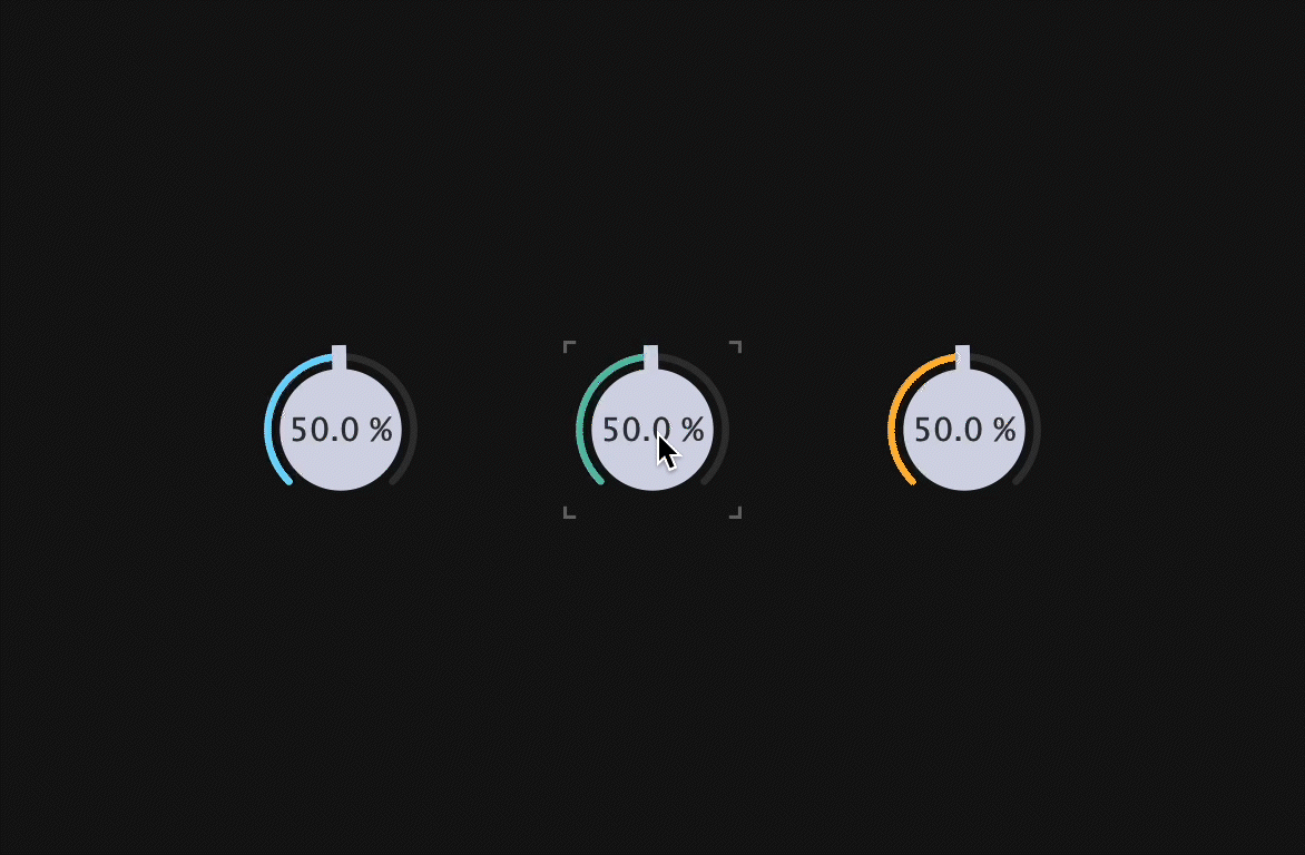
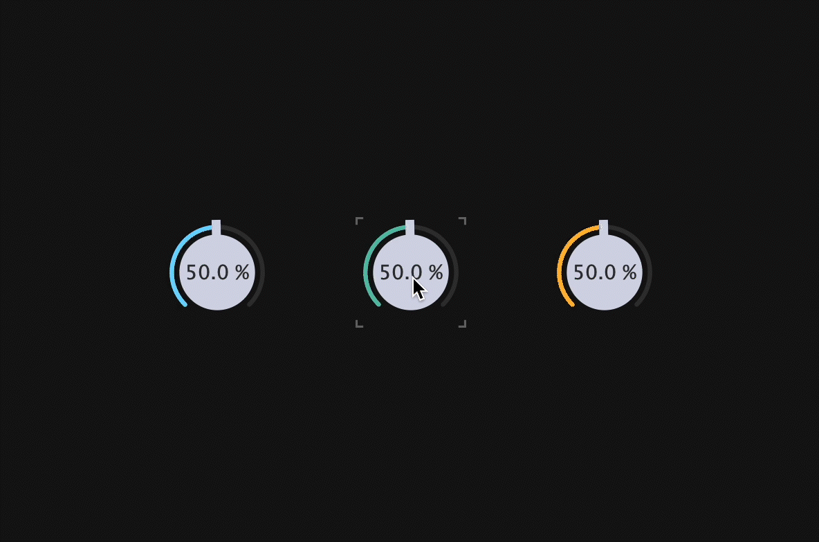
Now click and drag each dial, and as the focus changes, the mark will also change.
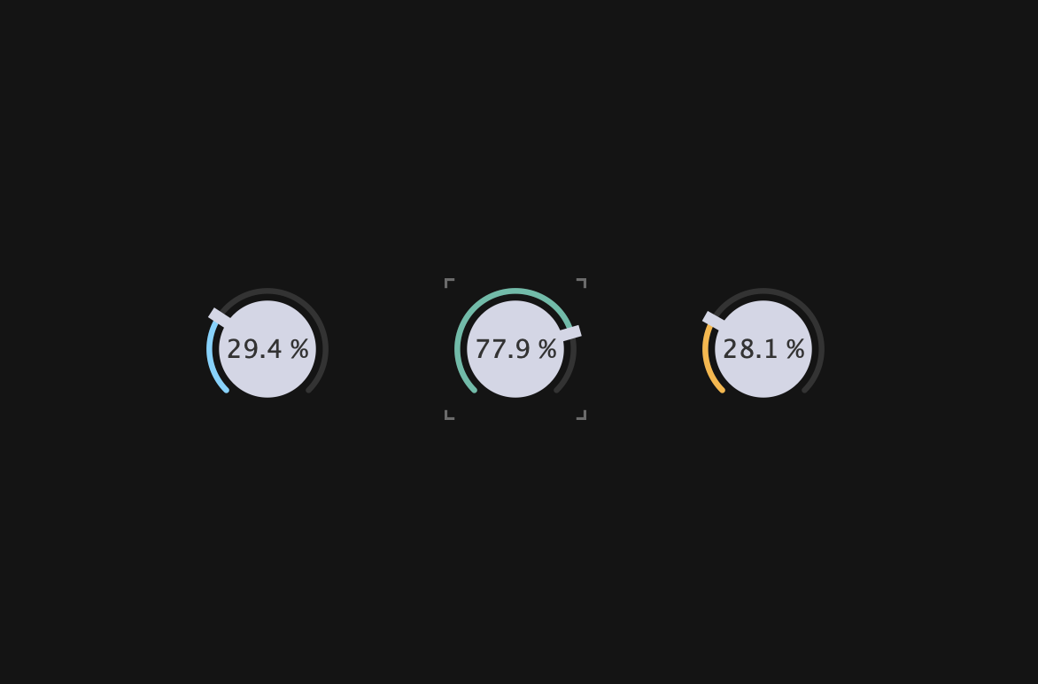
Finally, since clicking on something other than the dial does not lose focus and the mark does not disappear, to improve it, setWantsKeyboardFocus() must also be called in the constructor below.
MainComponent::MainComponent()
{
    setSize (600, 400);
    setWantsKeyboardFocus (true);
・・・
}
That’s all the implementation done!
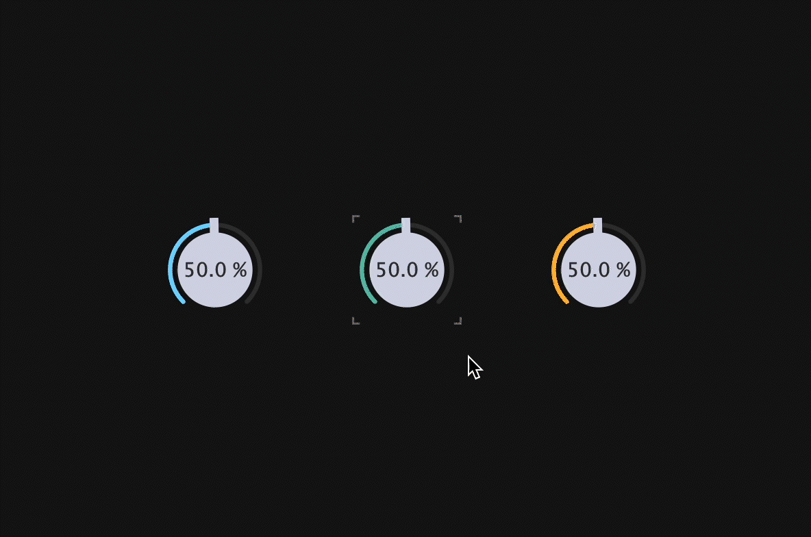
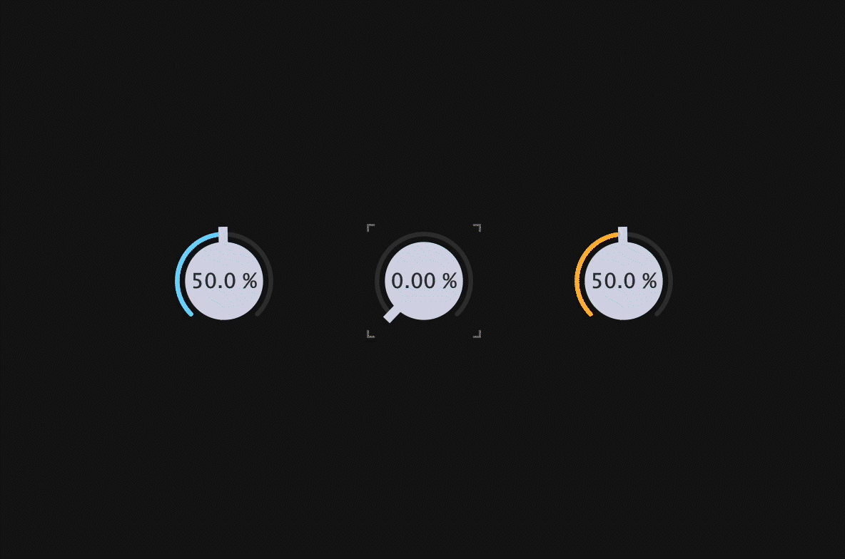
As you can see, when you click anywhere other than Dial, the focus is lost and the mark also disappears.
Conclusion
In this article, we explained how to create Modern Dial. If you have a more efficient way to implement this, please let us know in the comments or DM. Happy coding!